Posts

Final Portfolio

Image
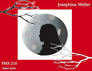
  For my final portfolio, I decided to design the front cover, index, back cover, and the small details around the word I chose to use for my logo, which is "mystery". I chose this because the logo was a big part of the class and we did a lot of projects surrounding it. I enjoyed the theme of it, so that's why I also chose it for my theme in my portfolio. I kept the same colors I used for my logo, and kept the moon idea because that really speaks "mystery" to me. The branches were added details throughout the whole portfolio to help keep it all cohesive but simple. I decided to do for my cover a silhouette of myself to add to the mysterious vibe. The font I chose was more graphic because I wanted to keep it modern and simplistic like I have for my logo, but still be representative of the theme I was going for. 

Business Cards

Image
For my business cards, I decided to keep the same dark colors with a touch of red to help keep the mystery affect. I decided to add a halo effect to the logo to two of the designs to mimic the moon glow I have in my logo design and keep the same dark mystery around it, while helping maintain the modern feel as well. I wanted a modern geometric look, so I keep everything very simple and sleek. My favorite is probably the brick one because of the drop shadow effect and the brick vertical background.   
Image
 

PsH3

Image
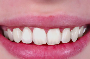
I found this process pretty easy. I feel like we had a lot of practice with the tools in photoshop, that it felt like second nature. It was interesting trying to find a mind ground of whitening, but not too much whitening with the teeth, but I think I found a good amount of whiteness that was still realistic but fixed.  

Somewhere

Image
I decided to photoshop myself into a scene of Hell's Kitchen, because I find this show to be entertaining and I think it's pretty funny (at least to me). I decided to put myself behind the counter instead of in the kitchen because I didn't have a chef's outfit that matched the other chefs. This project was relatively easy, since we had a lot of photoshop practice prior to doing it. I decided to also change the tone of my skin to a more pink tone to match everyone else's in the photo to blend more.   

PsH2

Image
This photo would be hard to photoshop yourself in because of the detailed railing in front of him. I am inspired by this one because it has a more emotional feel with the black and white.  This one made me laugh. I also like this one for the fantasy, emotional kinda feel.   

Autoscopy

Image
  For the autoscopy project, I decided to take a more abstract route, and not make the image so literal. I decided to use images that included space, books, a third eye, and some bright light as a way to say that knowledge is powerful. I didn’t want to necessarily just include the books in my project, because knowledge to me is beyond that. It includes intuition which is why I included the third eye. I used bright colors to represent the immense power knowledge can have and I made it colorful to invoke this “awe” feeling. I decided to white out my eyes to show that knowledge is more than just seeing as well. It’s being open minded and exploring things beyond what we already know and can see with our eyes.