Business Cards


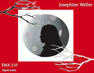
For my business cards, I decided to keep the same dark colors with a touch of red to help keep the mystery affect. I decided to add a halo effect to the logo to two of the designs to mimic the moon glow I have in my logo design and keep the same dark mystery around it, while helping maintain the modern feel as well. I wanted a modern geometric look, so I keep everything very simple and sleek. My favorite is probably the brick one because of the drop shadow effect and the brick vertical background.

Josephine, I love your business cards! I actually did something similar for my logo using mountains, trees, and then mine had a sun! I think that the colors of your logo give off a mysterious vibe and paired with the gradient cards continues with that theme. I really like the red bricks with just the white outline logo, I think it pops and it's different. Great job on these!
ReplyDeleteJosephine, I love the way this project turned out I am really impressed! I feel like I was able to get a better look into your personality and the things that you enjoy. I felt that while each of the designs were simple, they still kept me engaged, really good work.
ReplyDeleteThis was a really creative design for the project. I love how haunted your cards look. The designs are super nice and easy on the eyes. The gradient in the first one is flawless and the brick wall design on the second is super cool.
ReplyDelete