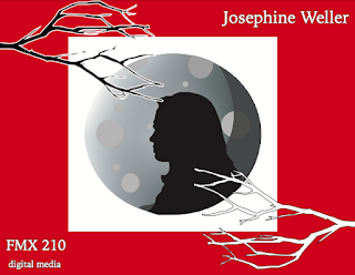
For my final portfolio, I decided to design the front cover, index, back cover, and the small details around the word I chose to use for my logo, which is "mystery". I chose this because the logo was a big part of the class and we did a lot of projects surrounding it. I enjoyed the theme of it, so that's why I also chose it for my theme in my portfolio. I kept the same colors I used for my logo, and kept the moon idea because that really speaks "mystery" to me. The branches were added details throughout the whole portfolio to help keep it all cohesive but simple. I decided to do for my cover a silhouette of myself to add to the mysterious vibe. The font I chose was more graphic because I wanted to keep it modern and simplistic like I have for my logo, but still be representative of the theme I was going for.


Comments
Post a Comment