This is the graffiti version of my logo. I decide to pick a darker red color to keep the mysterious vibe. I wanted to make the scratches very readable to help with the grunge look as well.
Your tag brush is one of my favorites because of the major detail yet simplicity of it. At first it looks like a lot is going on but the mountains actually stand out clearly and even if you were to adjust the size of your tag brush, the viewer would still be able to see the mountains. Really great job and I enjoy the paint you picked to layer it. Very realistic mountains too!
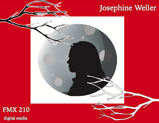
For my final portfolio, I decided to design the front cover, index, back cover, and the small details around the word I chose to use for my logo, which is "mystery". I chose this because the logo was a big part of the class and we did a lot of projects surrounding it. I enjoyed the theme of it, so that's why I also chose it for my theme in my portfolio. I kept the same colors I used for my logo, and kept the moon idea because that really speaks "mystery" to me. The branches were added details throughout the whole portfolio to help keep it all cohesive but simple. I decided to do for my cover a silhouette of myself to add to the mysterious vibe. The font I chose was more graphic because I wanted to keep it modern and simplistic like I have for my logo, but still be representative of the theme I was going for.
I decided to photoshop myself into a scene of Hell's Kitchen, because I find this show to be entertaining and I think it's pretty funny (at least to me). I decided to put myself behind the counter instead of in the kitchen because I didn't have a chef's outfit that matched the other chefs. This project was relatively easy, since we had a lot of photoshop practice prior to doing it. I decided to also change the tone of my skin to a more pink tone to match everyone else's in the photo to blend more.


Your tag brush is one of my favorites because of the major detail yet simplicity of it. At first it looks like a lot is going on but the mountains actually stand out clearly and even if you were to adjust the size of your tag brush, the viewer would still be able to see the mountains. Really great job and I enjoy the paint you picked to layer it. Very realistic mountains too!
ReplyDelete